Sleeklens Presets – Put to the Test

A few months ago I received an email from a software company call Sleeklens. They offered to give me a set of their Lightroom Presets (Through the Woods) for free in exchange for a product review. At first I was skeptical because I had never heard of this company or so I thought!
I searched their internet page and contacted another photographer, Mike Moats (he was listed on their Facebook Page), he recalled their products, and said, “Why not give it try?”
I contacted Sleeklens and ideally they wanted a turn-around time of a couple of weeks. I knew based on my schedule and other life happenings, it probably would not happen for a couple of months!
My opinion on presets is not a “Hip-Hip-Hooray” attitude. My past experience with presets are “It’s a good start” then I have to tweak to get it to the stage I want it. With that being said, I think my review may come as a surprise!
I have other presets that I’ve received from other companies, either as a premium or something I’ve purchased. I opened the presets in Lightroom and noticed I had other presets from Sleeklens…I’m not quite sure where I had downloaded them from. I played around with them a little; at least it was somewhat of an assurance this was a legit company.
I had just returned from Yellowstone National Park and was still playing around with my images when the email came with the “Through the Woods” presets. The presets come with Develop and Adjustment Brush presets. I had loaded some of my previous brush presets in the wrong folder and with the instructions I moved those to the correct location so I had a whole new game going!
Lets look at before and after images. Many of these I did reset to the original, some I added the preset after my initial adjustments were present.
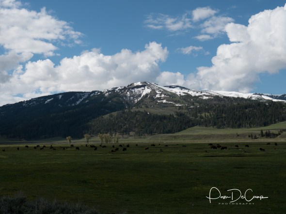
Original unedited image
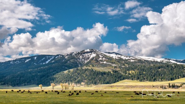
After making adjustments on my own I added the Break of Dawn preset and it gave the image warmth and opened the shadows.
I felt encouraged after I saw the results of this image so I tried another.

Original image

I used the Exposure-Brighten preset on this one.
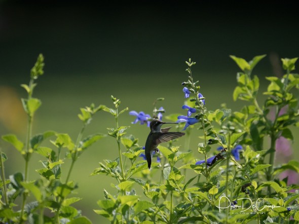
As Shot

The humming bird was initially adjusted with the Heavenly Warmth preset then I used the Brighten Shadows adjustment brush to pull out the details.

As shot
I used the Calm Sunset preset and then made further adjustments with graduated filters, luminance, and temperature.
Since the color presets were working so well, I decided to do a monochrome image.
I picked this image because in color the water was still brown and thought it may look better in black and white

I used the Pressed in Time preset, then added Monochrome Fantasy, and darken shadows and less highlights.
By now I feel that using the Sleeklens presets is definitely a great start to any image, but also can stand alone!

As shot
I aded Warm Shadows preset; adjusted shadows and clarity…BOOM…that’s all I did!
As shot

Calm Sunset preset added and highlights adjusted.
As shot

I used Darken Shadows preset and Autumn Colors
To conclude, yes, the Sleeklens Through the Woods presets are a “winner, winner!” I went in feeling very skeptical about using a preset, but the more I played and worked with them, it became apparent that the presets could function on their own without much help or further adjustments. I give this a thumbs up! To purchase your set of presets and brushes you can go to Sleeklens for Lightroom
Leaves

Until recently I did not realize how many different types of leaf photographs I had. Leaves are fascinating. They bud in the spring and are a lively green; then in the fall, they change to reds, yellows, and oranges. Structurally, leaves have veins, stems, and are textually interesting. I love to bring that texture forward in my photographs.


I had posted the above before and after in my post “Creativity: Where Does it Start?” I had transformed the ordinary palm leave to be viewed “differently”. I feel as a photographer it is my job to challenge our view of reality from time to time. The processing I chose for this image changed the color as well as the perspective of the image. It also highlighted the details in the leaf and stem.


On the left you see the original image of the green leaves. I liked how the light was hitting the leaves and felt there was a “photograph” somewhere in this image. I began using my crop tool and started dragging it around the image until I settled on a crop I thought was pleasing to the eye. There was so much going on in the original photograph that I needed to isolate a section. I then converted it to black and white. The tonal range of the image worked well with that choice. I then finished my editing in On1 Effects to add texture and to bring out the details in the leaves.


The above sycamore leaf was taken with my Sigma 120 – 300 f/2.8 zoom. I removed the lower right stem with the patch tool in Photoshop, then edited the color and texture in On1 Effects. The transformation was just what I wanted.
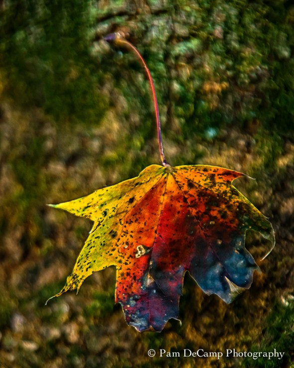
Maple Leaf
I was trying out my Tamron 28 – 300 f/3.5 – 5.6 and captured this leaf hanging off of my maple tree. I was exploring for things to photograph with the lens as I had just purchased it from KEH. I brought out the texture and details using On1 Effects. The sharpening tools in On1 Effects does a great job bringing out the details in images.
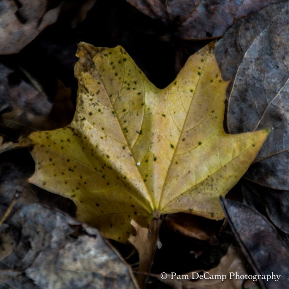
Maple Leaf
This was another leaf I was practicing on with my Tamron 28 – 300 f/3.5 – 5.6. It was a single color leaf among the dry gray and brown leaves. It caught my attention while walking around my patio.
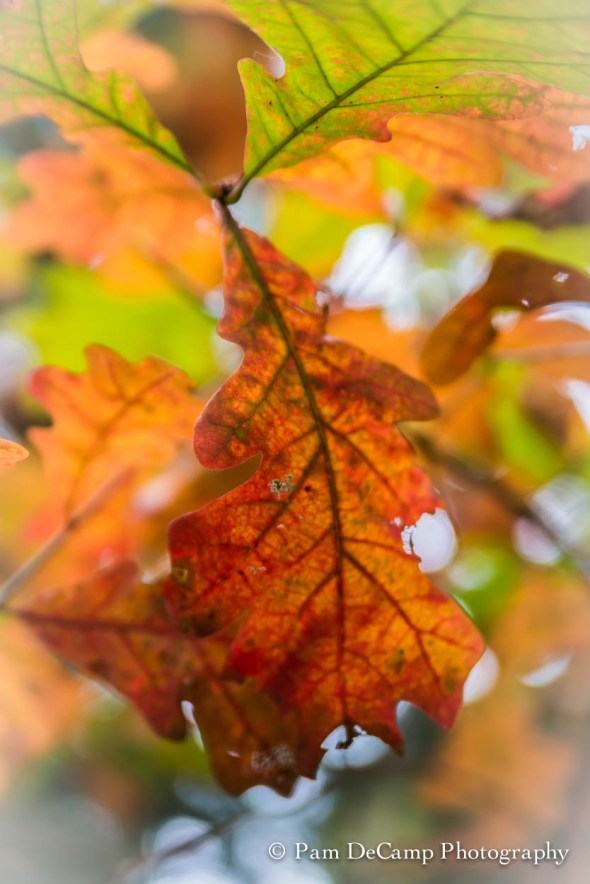
Oak Leaf
I spotted the oak leaf while walking around William and Mary College’s Campus this fall. While the image itself is a little soft, I enhanced that softness by decreasing the clarity. The colors are very vibrant. I added a soft white vignette to make the leaf stand out.


Above are a few of my other leaf images I have captured over the last year. I hope you enjoyed exploring the world of leaves! Effects 10 is available as a free download!

Lightroom Presets


Direct Positive Preset in Lightroom
Lightroom presets are interesting. Most of the time I prefer to edit my own images. If I do decide to choose a preset, I end up making additional adjustments, so I figure I should start from scratch anyway.
I saw the frosty fog rising off of the river on Sunday morning and noticed how the trees became frost covered. I know the time frame to capture this is short and it was already 10:00 a.m. I knew I had to get moving!
I used a 0.6 ND filter, because the sun was so bright and it really separated the blue sky while maintaining the white snow. I photographed these images with my Tamron 24 – 75mm f/2.8 on my Nikon D800E at ISO 50. Shutter speeds and aperture varied depending on the light. Most of the time it was at f/8 – 11 and 1/100 – 1/200.
In post I decided to try the IR preset. Some of the images were very impressive using this preset. I do like a little more contrast, so I adjusted the blacks and contrast slightly to give me the look I wanted.
I hovered over some of the other presets and the Direct Positive really made the images pop with color! The contrast between the blues and whites was beautiful! Direct positive is a process dating back to the 1800’s. Typically, the image was captured directly onto the paper and it was a black and white image. In Lightroom, the direct positive setting increases the saturation, blacks, and highlights and produces a very high color image. The image can be easily converted to black and white after using the Direct Positive preset.
The images below demonstrate the use of 2 different presets in light room; Direct Positive on the left and infrared (IR) on the right.


While I do like my images to have a little more contrast (more pleasing to my eye), there is something about the subtleness of the image below that I like. Left is the original and right is IR. I did remove the boat from the image.


The vignette in the corners is from my ND filter on the camera. I do attempt to remove that with cropping or adding a reverse vignette.
I suggest you try some of the presets in Lightroom; what is nice, Lightroom gives you a preview of what it will look like. I use this as a starting point then make my own adjustments. I have also set up my own presets in the past if I’m editing a batch and making the same changes throughout.
Have fun experimenting in Lightroom!
